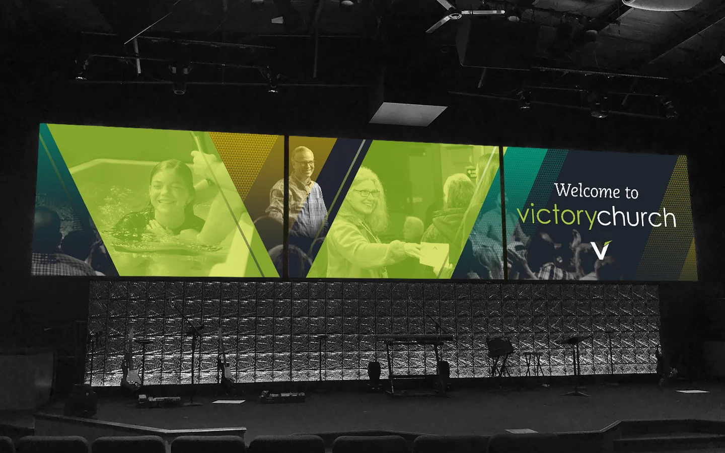
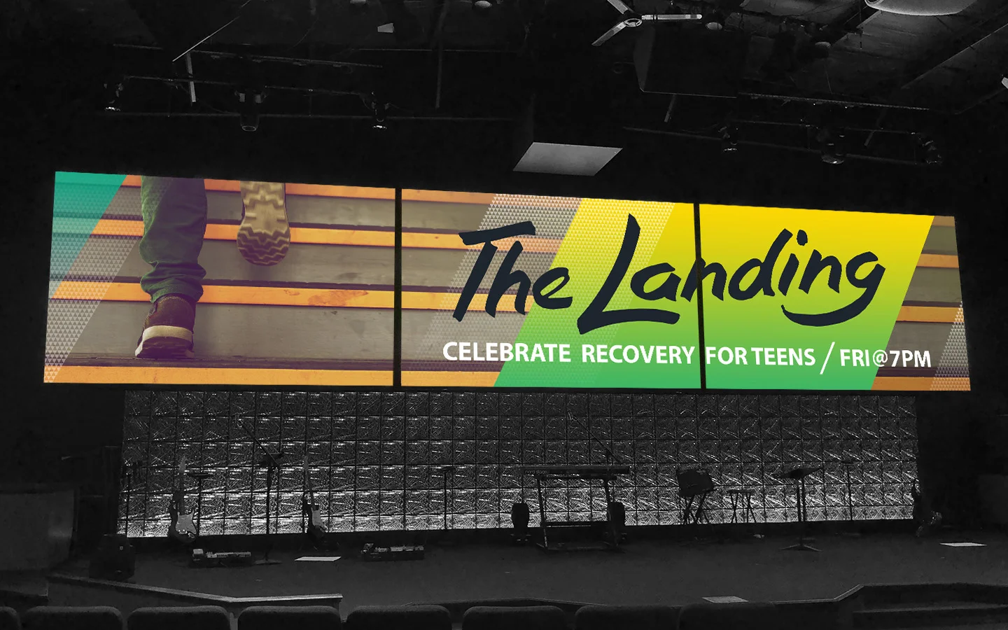
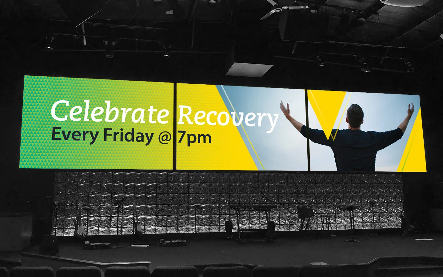
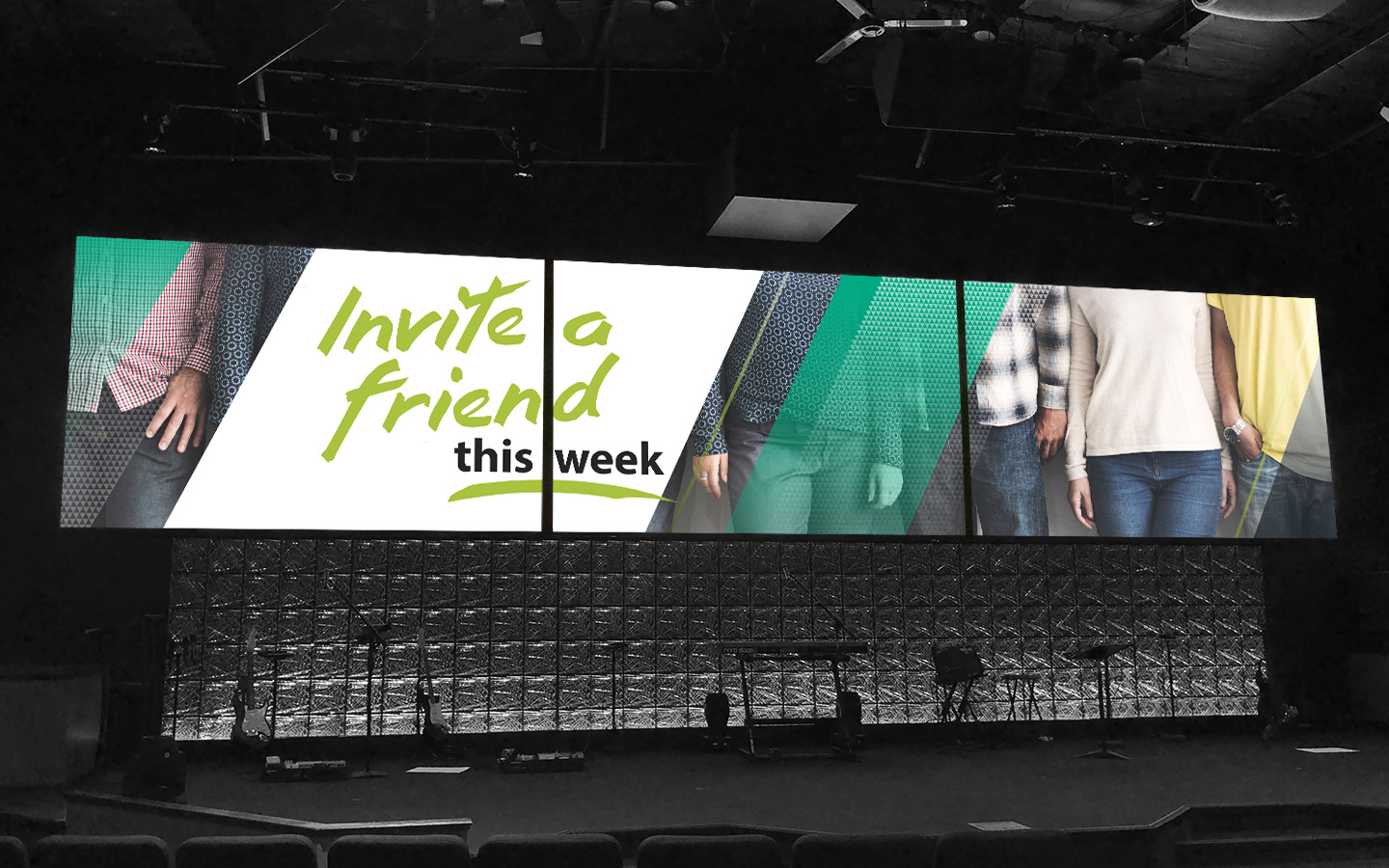
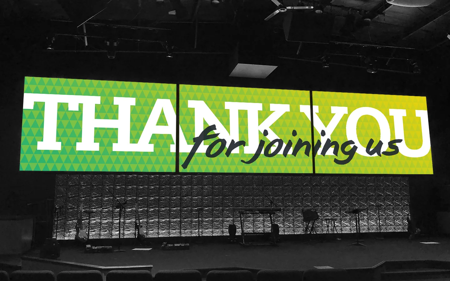
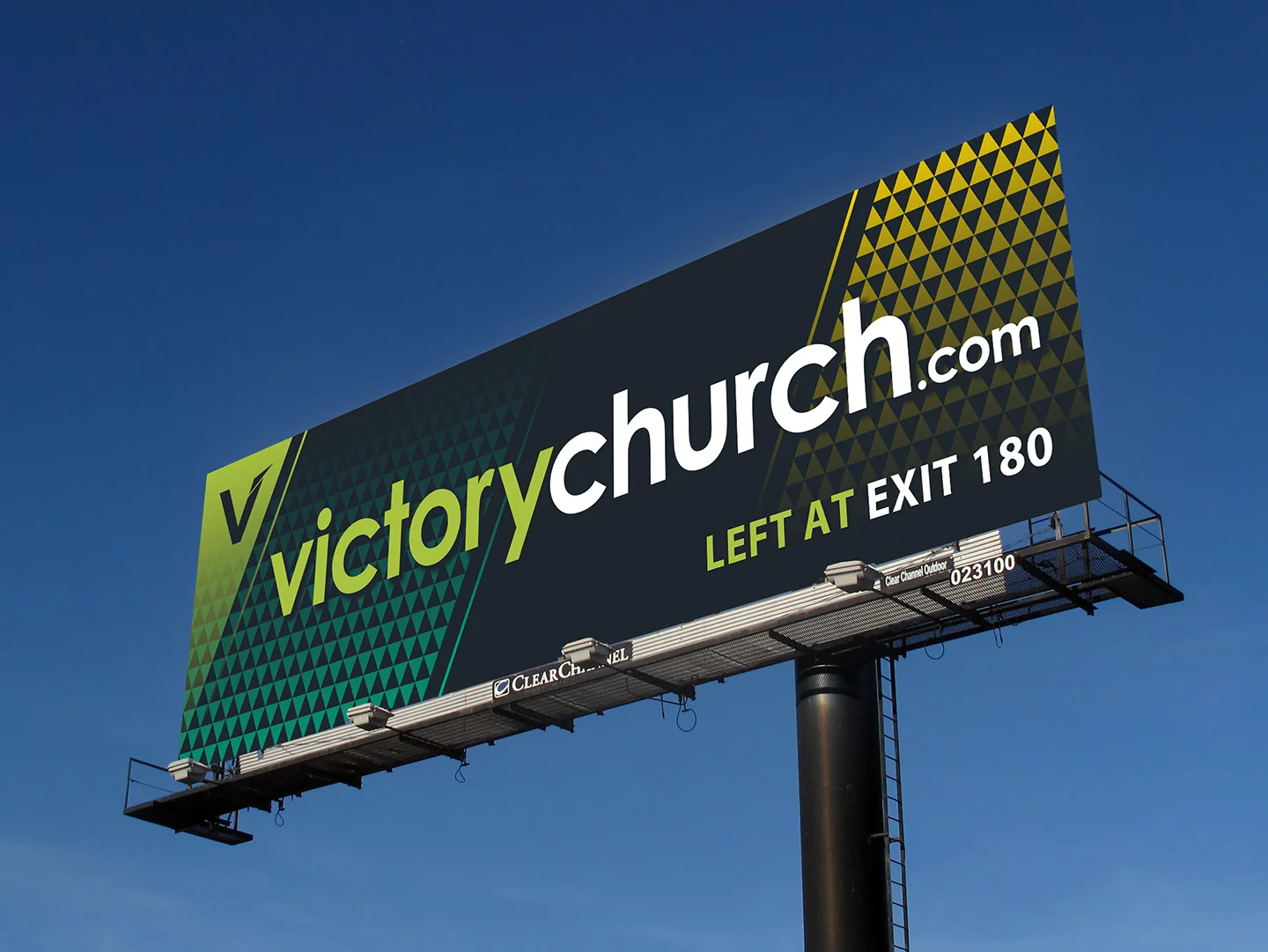
Like many churches, Victory Church had no established branding system or guidelines in place. As a result, their visual approach lacked cohesion and didn’t help to set them apart or distinguish them. Beginning with the existing logo and a single green color they currently used, I built a visual system that complimented the existing branding and reinforced their unique identity. I extended the brand color palette to include a darker shade of green and a bright yellow that, when mixed, created the existing green color currently in use. I also supplied them with a “tool kit” of graphic elements and building blocks that could be utilized to create future branded materials and content. These consisted of patterns, frames, holding shapes and additional elements inspired by the “V” of the existing logo. By creating a visual system inspired by the logo and building a color palette based on the current brand color, I was able to ensure that the new branding gave Victory Church a unique, ownable look that reinforced the brand and distinguished them in the St Louis community.