BickHealth provides hospitals with technology solutions that allow patients to access their personal healthcare data and communicate better with their doctors. The current state of a this data can be visualized as trapped inside an impenetrable, black box that patients can’t access. The mark we created for BickHealth represents the data being freed from that box. The hand drawn scribbles and type are in stark contrast to the hard edges of the box and convey the humanity and individuality of each patient who can now access their personal information which was previously trapped inside the healthcare institutions.
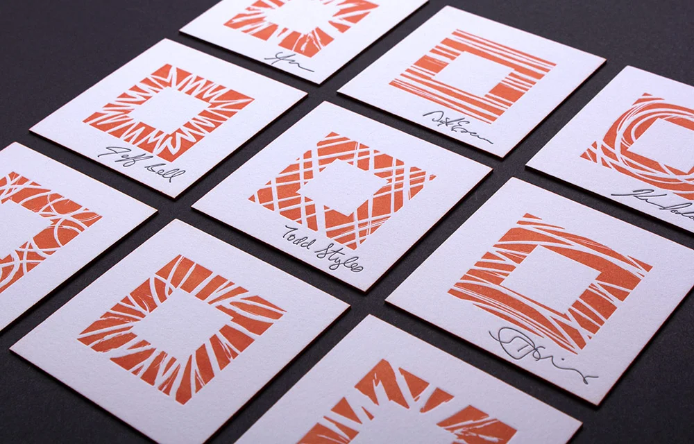
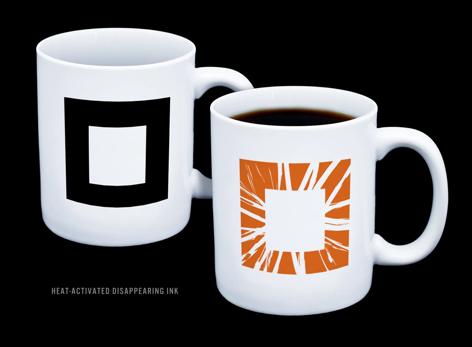
Throughout the brand launch we continually looked for ways to communicate the concept behind the new branding. To demonstrate BickHealth’s commitment to acknowledging the humanity and individuality of every person, we produced letterpress business cards with individualized squares and personal signatures for each member of the team. We even challenged ourselves to think beyond the traditional branded coffee mug with mugs featuring heat-activated ink. As coffee is poured into the cup the closed black box transforms into the orange, opened up box representing the freeing of healthcare data.
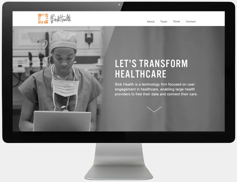
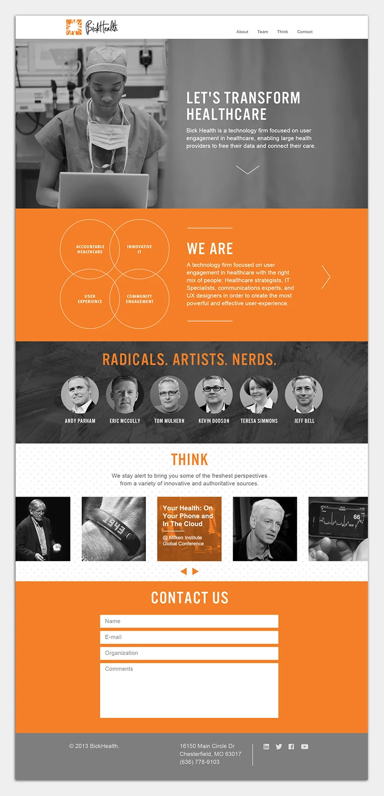
For BickHealth’s website we avoided anything that felt like fluff or information overload. Instead we opted for a clean, simple, to-the-point approach. We wanted visitors to be able to quickly and easily understand who BickHealth is and what they do. Likewise, we wanted them to see and hear from the real people behind the company in the form of photos, bios and a blog where team members shared articles and insights highlighting their specific areas of expertise.
We dug deep to understand BickHealth’s values, purpose and mission and utilized those insights from the beginning. Doing so allowed us to avoid the visual trends of similar companies in the tech and healthcare space and build a strong brand that is both different and meaningful.